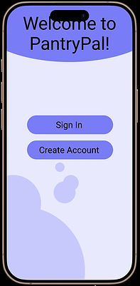
Mobile App design
Case Study Overview
As a team of three designers, our task was to brainstorm and develop a mobile app that addresses common everyday frustrations. We set out to create a platform that helps people seamlessly plan and cook healthy meals successfully from start to finish. This case study highlights our research and design process, which was informed by field research, one-on-one interviews, public surveys, and user testing—allowing us to shape a user-centered design system.
goals
Our goal was to design an app that serves as a one-stop solution for meal planning, allowing users to seamlessly take stock of the pantry/fridge, find personalized, step by step recipes, and order groceries. To create a truly user-centered experience, we conducted research to understand our users' needs and pain points, ensuring our design effectively addressed those challenges. Additionally, we prioritized an optimized user experience, making meal planning effortless and intuitive.
our process

Define
Research
User Flow
IA/Prototyping
Test
Iterate
phase one
define
After brainstorming common everyday challenges and analyzing existing meal-kit apps, we recognized a key issue—while many meal-kit services are useful, it can be difficult for seniors to navigate these apps. Also, finding the right portions and deciding on recipes can be a hassle.
To address this, we identified our target audience as adults aged 50-75, including those who live alone and families/ groups of all ages and sizes. From there, we defined our key features, such as a photographic scanner taking stock of all current groceries, personalized list of dietary restrictions and favorites, step-by-step cooking instructions, delivery services, grocery maps showing proximity and stock, as well as budget tracking, creating a seamless all-in-one food shopping experience.

Example of portfolio stock photos made in photoshop.
phase two
research
surveys
We designed a brief seven-question survey to gain deeper insight into our target audience's wants, needs, and expectations. The survey received 22 responses, providing valuable data to inform our design decisions.
Where do you like to buy groceries?

Super Market
High-end Markets (Trader Joes, Whole Foods, etc.)
Farmer's Markets
Specialized Markets (deli, cheese shop, ethnic market)
Garden
All of the above
Key Findings
-
Small-Batch Cooking: The majority of users cook meals for 1–3 people.
-
Recipe Discovery: 55% of surveyed users find recipes online.
-
Dinner Budget: 54% of users spend less than $20 on an average dinner.
-
Grocery Outing: Older users enjoy the experience of going to the grocery store as part of their routine.
interviews
We then visited a local adult center where we conducted interviews with five users from our target audience- two men, and three women, asking a series of questions in order to gain insight into their eating habits, meal preferences, and the factors that influence their meal planning.
Example of Empathy Map
By process of analyzing key takeaways from each interview, we then used affinity mapping to categorize common feedback. From there, we went into empathy mapping further allowing us to narrow down findings; identifying patterns and determining the most essential features for our app.


Key Findings
Example of group interview.
-
User is not tech-savvy and distrusts technology with personal information.
-
Prefers to shop in-store to maintain control over budget, portions, and nutrition.
-
Relies on recipes for meal prep and planning.
-
Sees benefits in meal kits, but finds them too expensive.
-
Needs a simple, straightforward experience with minimal tech complexity.
-
Values clarity, trust, and transparency in digital interactions.
phase three
user flow
We next worked to determine our intended user experience from start to finish.

User Journey Mapping

Legend
User task flow starting at setup.

User task flow starting at homepage.

Phase four
IA/Prototyping
When designing our Information Architecture, we prioritized a simple and user-friendly navigation menu.
We chose a concise structure to ensure seamless usability, ultimately including the following key sections: Home, My Profile, Favorites, and Deals.
wireframes

Here is an example of some of our basic wireframes to start our design process. On the left you will find one of our AI questionaire set-up pages and on the right you will find the users' completed profile page.
phase five
Test
For usability testing, we conducted moderated in-person sessions to directly observe user reactions and thought processes. Our key objectives were to ensure users could navigate from the home page through the recipe generation process, understand each page's intended task, and move seamlessly between pages. Success was measured by a user’s ability to complete these tasks smoothly.
Example of interview testing.
phase six
iterate
Here, you'll find some of our final iterations, showcasing the refined designs based on insights gathered from user testing.
Outcomes

Pantry Pals made meal planning and pantry management easier and more enjoyable for users of all ages, with particular impact for older adults. Simplified navigation, larger UI elements, and clear labeling improved usability, while personalized recipe suggestions and inventory tracking streamlined daily tasks. Usability testing confirmed that older users found the app approachable, intuitive, and satisfying to use.